The Project in Section 5.3 of the textbook derives an equation for the fraction A of a population that is ultimately infected during a disease outbreak. Here we will explore these ideas in more detail.
As an example, Figure 1 plots data from a plague outbreak in Bombay India (now Mumbai) in 1905 showing estimates of the number of infected people over time (the data can be downloaded from the link at the left). Once the outbreak was over (at week 30, which was July 21, 1906) a certain fraction of the population had been infected. This is the quantity A from Example 3.5.13.
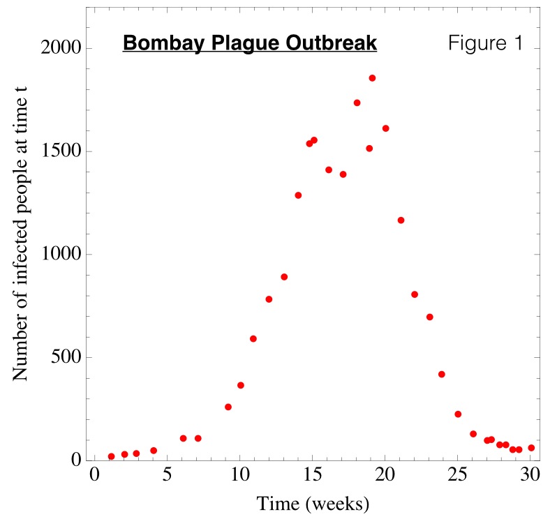
The data in Figure 1 were some of the first to be analyzed using mathematical models (see Kermack and McKendrick 1927). We will explore such models in detail later in the textbook (for example, see Exercise 7.6.23). For the time being the following animation allows you to explore the predicted outbreak for different choices of the constant q. The red curve is the number of people infected at time t (analogous to the data in Figure 1). The blue curve is the number of people who have not yet been infected, again at time t. The blue curve starts at 10,000 (the total initial population size) when t = 0 and declines to some final value that depends on q. The quantity A is the total number of people that were infected during the outbreak divided by the total initial population size.
The above animation illustrates how the value of A changes when q is changed and we can think of A as a function of q. The equation derived in this project of the textbook defines A implicitly as a function of q.
References
Kermack, W.O. and A.G. McKendrick. 1927. A contribution to the mathematical theory of epidemics. Proceedings of the Royal Society of London, Series A 115:700-721