Here we continue studying the antigenic cartography of influenza viruses by considering a better way to display such high-dimensional data. Recall that the influenza data from Example 8.1.6 and the associated BB material on this website give a measure of the antigenic difference between each of 35 viruses and five antisera (these data can be downloaded from the link on the left).
The plot below displays these data in three-dimensional antigenic space for different choices of antisera. Each point in the plot represents a virus, and the coordinates of the point represent the antigenic difference between that virus and the antisera on the coordinate axes.
One shortcoming of the above plot is that it can only depict data for three antisera at a time. It would be useful to have a way of plotting multiple antisera on a single 2-dimensional plot like that displayed in Figure 8.1.14 of the textbook.
To construct a plot like 8.1.14 of the textbook we must take a somewhat different perspective. Instead of using one coordinate axis for each antiserum let’s instead begin by placing a point in a plane that represents antiserum 1 (for the moment we won’t worry about what the coordinate axes in the plane represent). To make things concrete we will use the notation (w1, z1) to denote this point, where w1 and z1 are its co-ordinates.
Now let’s place another point in this plane that represents virus 1. We will use the notation (x1, y1) to denote this virus point, where x1 and y1 are its co-ordinates. To indicate the antigenic difference between virus 1 and antiserum 1 in this plot we ensure that, when placing the points, the distance between them is equal to the measured antigenic difference in the data. For example, the data in the link on the left show that the antigenic difference between virus 1 and antiserum 1 is 1.85 (recall that these measurements are dimensionless). Thus, when placing the two points in the plane, we ensure that

This is illustrated in the following figure, where the numeral 1 represents the antiserum 1 and the coloured dot represents virus 1..
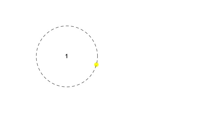
It is clear that there are many different ways to place the above two points in the plane. For example, we could start by placing the antiserum 1 point anywhere in the plane. Then, from our study of Section 8.1 of the textbook, we know that we simply need to place the virus point anywhere on a circle of radius 1.85 that is centred at antiserum 1 (represented by the dashed circle in the above figure).
So far we have included only one antiserum. The next step is to place another point in the plane that represents antiserum 2. In doing so we ensure that the distance from antiserum 2 to the point representing virus 1 is also as given in the data. The following figure again illustrates the idea for the first two antisera from data in the link on the left.
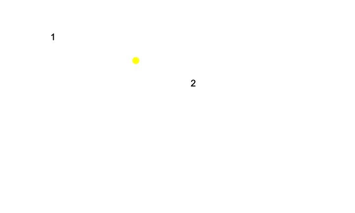
Again you can see that there is a lot of flexibility in terms of the actual coordinates of all three points. The only restrictions we have used when placing the points are the distances between the virus and each antiserum. This means that it is only the distances among these three points that are specified, and not where in the plane they are located. Therefore, the above plot can be translated in the plane, rotated in the plane, or reflected in the plane, and still preserve the antigenic differences between the antisera and the virus.
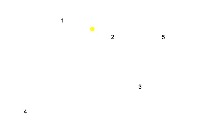
Now we can continue with a similar approach and include all five antisera from the data in the link on the left. This gives the following figure.
Our final step is to now place points in the plane that represent the remaining 34 viruses from the data set, where the distance from each virus to each antiserum is as given in the data. As we add each new virus point we might need to move some of the points that we have already placed in the plane in order to ensure that all the relevant distances between the points are correct. You might suspect though that as the number of viruses included increases, we will reach a stage at which we can no longer satisfy all the constraints of the data. Put another way, once the number of points gets large enough, it will no longer be possible to place them all in the plane in such a way that the distances among them are as given in the data. This is in fact the case. Therefore, the best we can do is to place all the points in the plane in such a way that the distance between each virus and the five antisera are as close as possible to the values in the data.
To see how we might employ the above idea it is helpful to introduce some additional notation. Let’s use Dij to denote the measured antigenic difference between virus i and antiserum j. These values are given in the data in the link on the left. Similarly let’s use dij to denote the distance between the point for virus i and that of antiserum j in the plane. That is,

Our goal then is to place all the points in such a way that the dij are as close as possible to the Dij , for all combinations of i and j. One way to formulate this condition mathematically is to first define Q as

Each term of the above summation is the squared difference between dij and Dij. So any given term will be minimized when the distance between the virus and the antiserum points in the plane, dij, is equal to the measured value Dij. Thus Q is a measure of the total deviation of the of the distances between the points from the values in the data. We then seek to choose all of the co-ordinate values xi , yi , wj , and zj so as to make Q as small as possible.
The above optimization problem is difficult to manage by hand but there are a variety of computer packages that can perform such tasks. The figure below plots all of the data from the link on the left using Mathematica to solve this optimization problem.
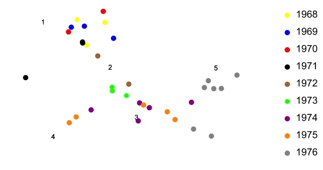
This is how Figure 8.1.14 of the textbook was created, but with a much larger data set. Notice in the above figure that virus strains from 1968-71 tend to form a cluster, as do strains from 1972-1975. The strain from 1976 tends to fall out on its own. And again it should be noted that the plot obtained above is not unique. As before, it can be translated, rotated, or reflected in the plane and the antigenic relationships among the points will remains the same. In this way, the coordinate axes of the plot are unimportant. It is only the relationships among the viruses and antisera that have meaning in the plot.
References
Smith, D.J. et al. 2004. Mapping the antigenic and genetic evolution of influenza virus. Science 305: .371-376