Example 8.1.3 of the textbook and the associated BB material on this website explains how an assay called the hemaglutination inhibition (HI) assay can be used to measure the binding strength between an influenza virus and an antiserum. The BB material from Example 8.1.3 also explains how such data can then be transformed into a measure of the antigenic difference between each virus and each antiserum. You can download this transformed data set from the link on the left. Each row in the data set represent a different virus and each column represents a different antiserum. The numerical values in the table are measures of antigenic difference between each virus and each antiserum as explained in the BB material from Example 8.1.3.
In Example 8.1.8 of the textbook and the associated BB material on this website we saw how one can display such high-dimensional antigenic data in two dimensions. The figure below plots all of the data from the link on the left using this method.
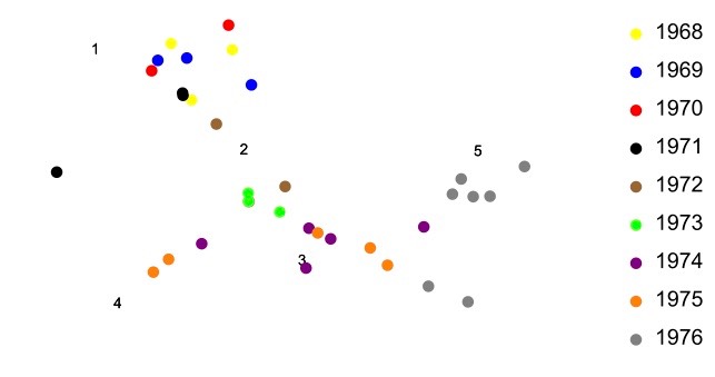
Each dot represents an influenza virus from a particular year, coded by color. Notice in the above plot that viruses from 1968-71 tend to form a cluster, as do viruses from 1972-1975. The viruses from 1976 tend to fall out on their own. As with Example 8.2.2 of the textbook, a vector whose initial and terminal points fall within different clusters represents the magnitude and direction of antigenic change between the corresponding years.
References
Smith, D.J. et al. 2004. Mapping the antigenic and genetic evolution of influenza virus. Science 305: .371-376