This project involving vaccine escape uses a somewhat simplified and artificial model of antigenic evolution. However, real antigenic evolution displays very similar patterns of vaccine escape.
As an example, Fonville et al. (2014) presented antigenic data for influenza viruses from 1968 through to 2009 (see the BB material on this website associated with Examples 8.1.3, 8.1.6, and 8.1.8 of the textbook for an explanation of how antigenic data is analyzed and displayed using antigenic cartography). This data showed how antigenic evolution by influenza occurs and how it can result in vaccine escape. In the figure below we display a simplified version of the antigenic data for influenza viruses from the years 2004 and 2005 (Fonville et al. 2014).
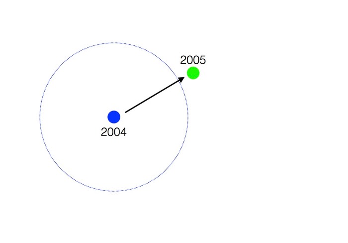
The blue point represents the location of viruses from 2004 in antigenic space and the green point represents that for the viruses from 2005. The arrow represents the vector of net antigenic evolution from 2004 to 2005 (see Example 8.2.1 of the textbook for a similar example). The vaccine used in 2004 protected primarily against strains within the blue circle. You can see that by 2005 the virus had evolved enough so as to escape protection by the 2004 vaccine. As a result, the vaccine was updated in 2005. This resulted in a new circle of protection shown as the green circle in the figure below.
We have drawn the green circle as being larger than the blue circle since the 2005 vaccine appeared to protect against a larger suite of influenza strains. Vaccine escape occurred once again between 2005 and 2009 (not shown on the above figure) resulting in another vaccine update in 2009.
References
Fonville, J.M. et al. 2014. Antibody landscapes after influenza virus infection or vaccination. Science 346:996-1000